The goal of the Museum of American Armor (MOAA) is to bring the sights and sounds of American history to a new generation, and thereby pay tribute to those who have dedicated their lives to defending our freedoms. Their exhibits and interactive reenactments present a virtual time machine designed to assist in telling the seminal story of American courage, valor, and sacrifice.
Overview
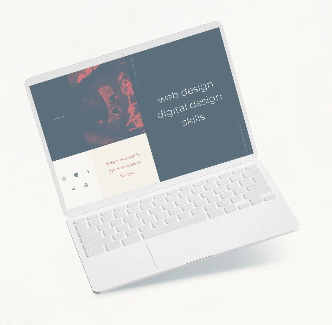
JS Design is a brand I've championed to represent my own design skills and abilities.
RESPONSIBILITIES
Branding
Design Systems
Web Design
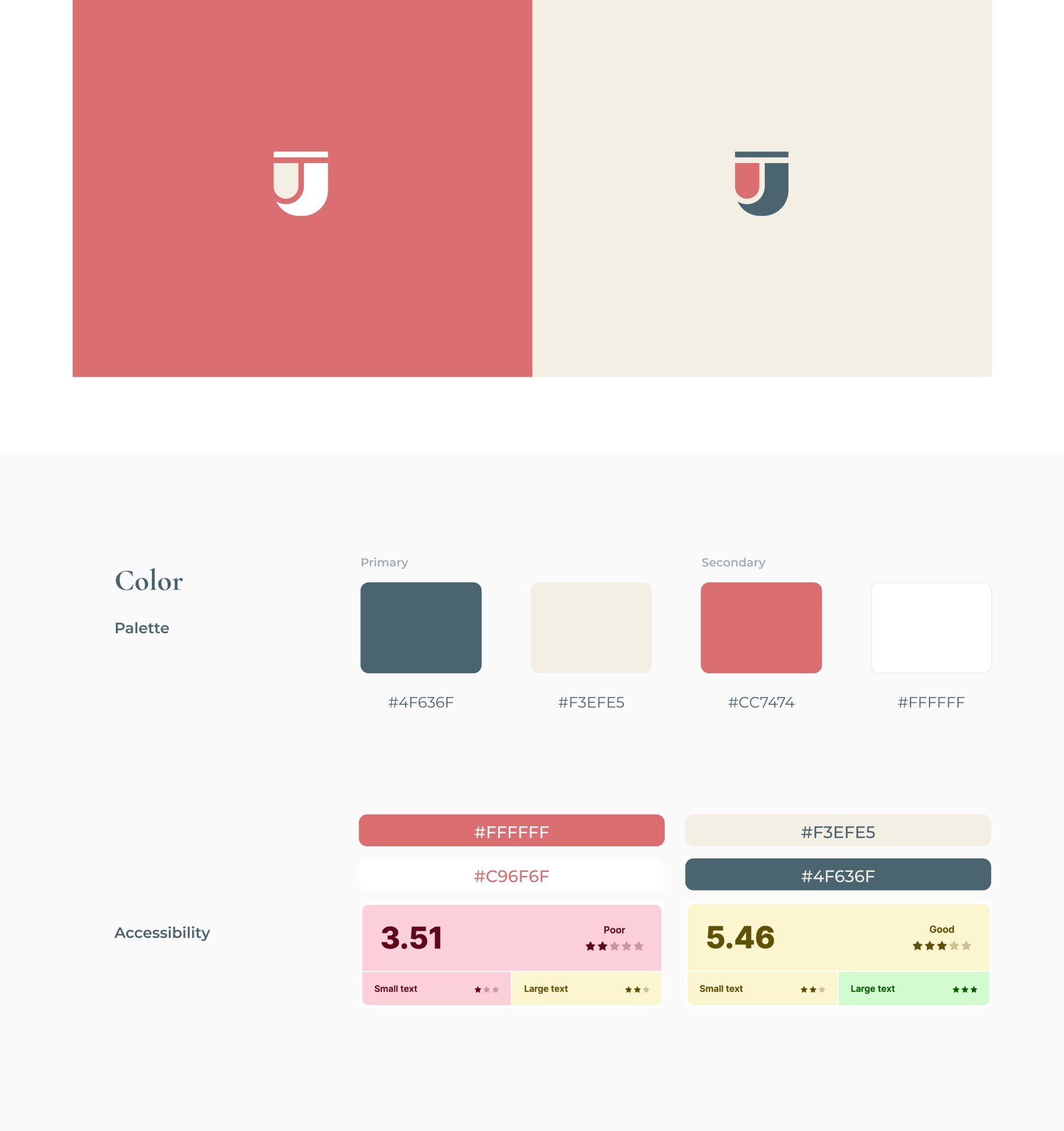
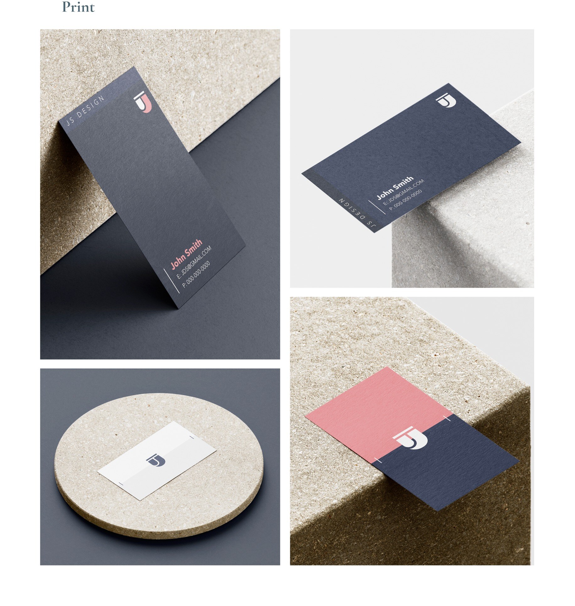
SOLUTIONS For the brand styling I utilized contrasting color combinations. I've always taken great notice of balanced design and greatly appreciate the right contrast and accents in brand identity. The light and dark color combinations along with the vertical and horizontal layout options provide more than one design solution.
CHALLENGE I enjoy designing minimally complex design assets. I wanted to implement this approach in business cards to represent my abilities and skills, along with my own personality and individual style. I also enjoy balanced design and options, I enjoy having more than one option for design solutions.
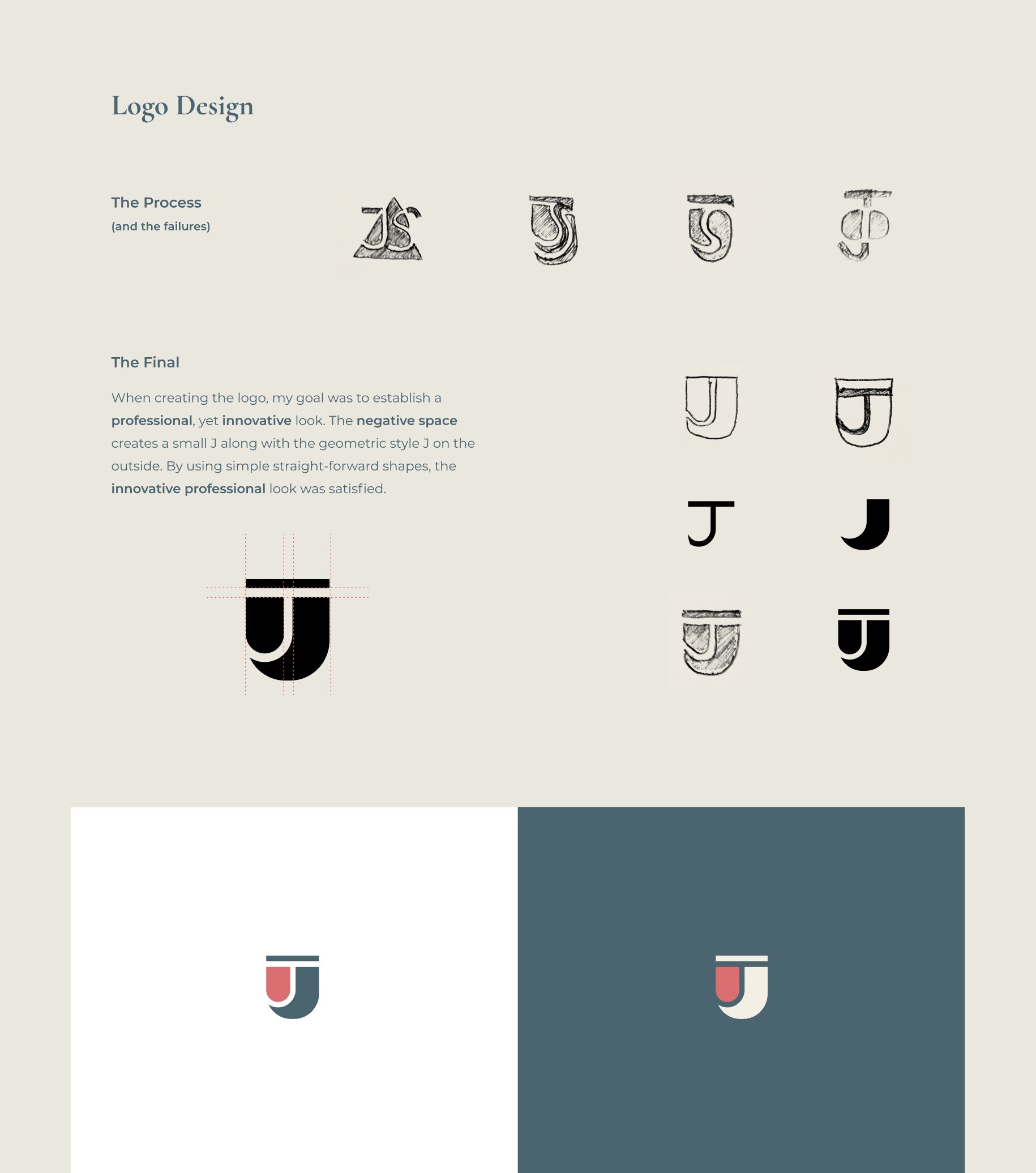
The Final When creating the logo, my goal was to establish a professional, yet innovative look. The negative space creates a small J along with the geometric style J on the outside. By using simple straight-forward shapes, the innovative professional look was satisfied.
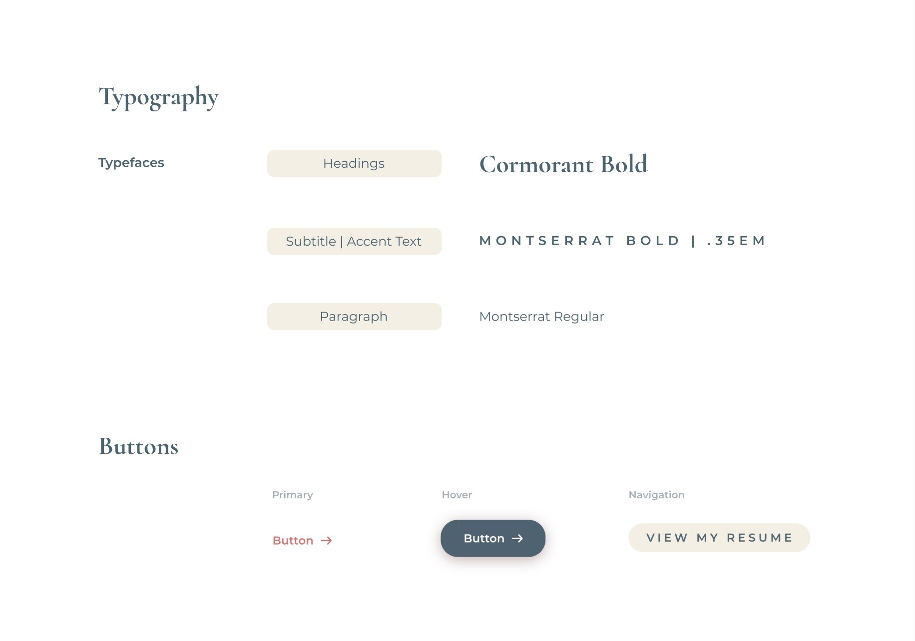
Typography
Color Palette
#EDBF4A
#847965
#252e2d
#242D2B
#e8e8e8
Challenges
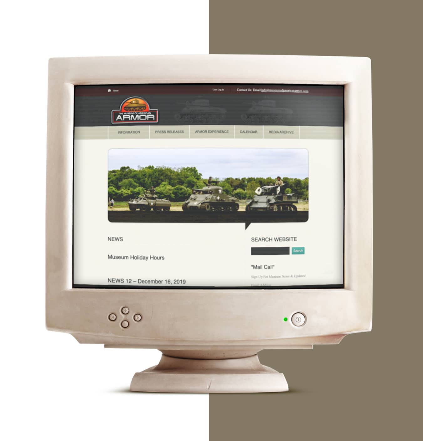
MOAA was suffering from a severely outdated, archaic website and online presence when I first started this project. This lack of branding, design, and UX architecture was limiting the museums ability to reach online users, get in-person visitors and gain new volunteers.
Visual Design: Stuck in the early 90's. Poor design fundamentals, hierarchy, and site architecture.
User Experience: Lacking excitement and engagement opportunities. No expression of an experience or storytelling.
Brand Identity: Virtually no brand consistency or identity. Dated color palette, typeface and logo.
Solutions
The strength of MOAA is the experience they have to offer. My goal was to tell their story by creating an interactive, valuable experience for the user to enjoy. I also wanted to increase engagement and SEO to reach the end goal of more visitors and volunteers for the museum itself.
Visual Design: I implemented a modern, clean design to the website through effective white space usage, intentional typefaces and a new consistent design system.
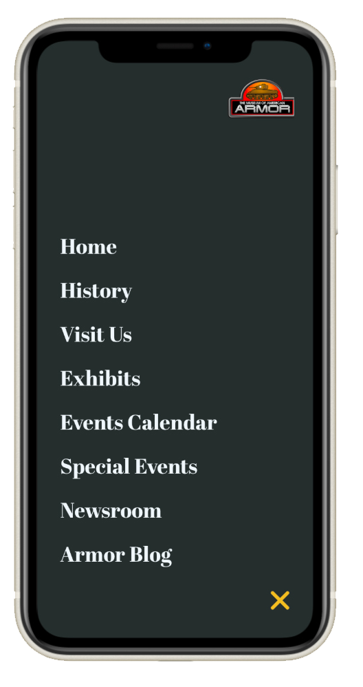
User Experience: Working collaboratively with the Content team, we revamped the navigation and created strategically placed CTA's and forms for engagement.
Brand Identity: The client wanted to maintain their logo, which introduced a possible obstacle, however I was able to maintain the logo while still building and reestablishing the brand through a new color palette, style guides and consistent layouts throughout the site.
Pain Points
Lack of Engagement Opportunities
Not Mobile Responsive
Lack of Hierarchy
No Engaging, Compelling Visuals
Poor Site Architecture
Lackluster Brand Styling
Wireframing
FEATURED CTA'S
Users need a simple "in-your-face" way to engage with the museum.
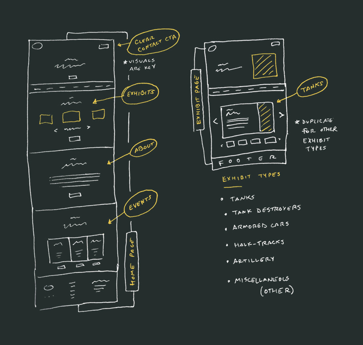
EXHIBITS FEATURE
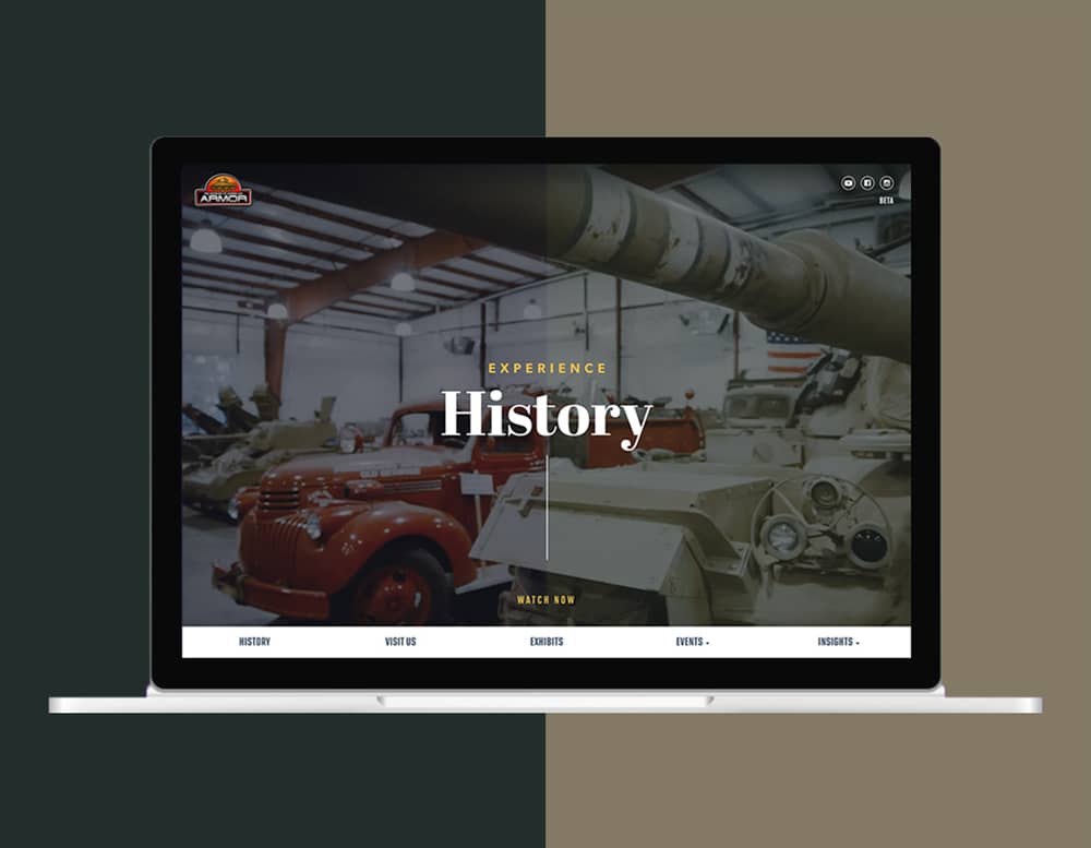
The biggest attraction, visually and historically for the museum is the range of operable exhibits (vehicles, artillery, etc.). This needed to be interactively featured as near to the fold as possible.
VISUALS ARE KEY
Exhibits are best expressed visually. Incorporating high quality image placeholders in the wireframe was important. Both in the hero and in the modules below.
REUSABLE MODULES
Each exhibit category has it's own coded interactive slider for shuffling through exhibit info and imagery. This gives the user options for exploring while also organizing information in an easily digestible way
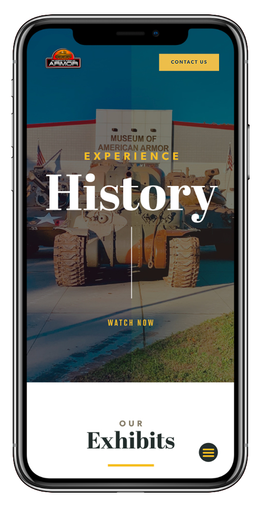
Mobile Optimized
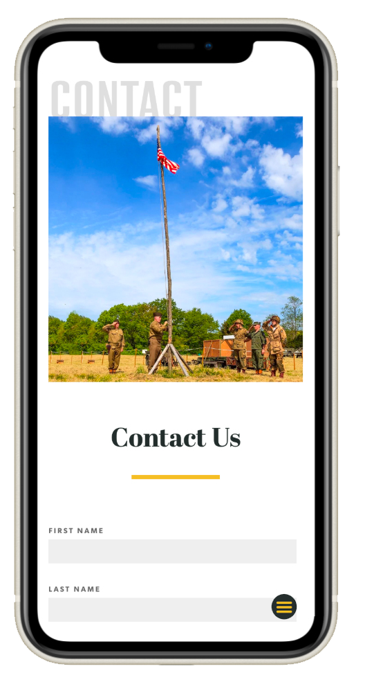
Engaging, Quality Visuals
Communicating a unique experience is accomplished in the redesign by simply utilizing images of the museum and events.
Increased Engagement Opportunities
Forms were incorporated for all pages as well as calls-to-action for contacting, volunteering and donating to the museum and its work.
Impact
After launch of the redesigned website, user engagement increased by 66%. Strategic interaction design called for more engagement opportunities (CTAs and forms) and the implementation of these opportunities resulted in more in-person visitors, donors, and volunteers. Incorporating compelling, engaging visuals allowed users to see the unique experience the museum has to offer as a consistent, compelling, modern brand.